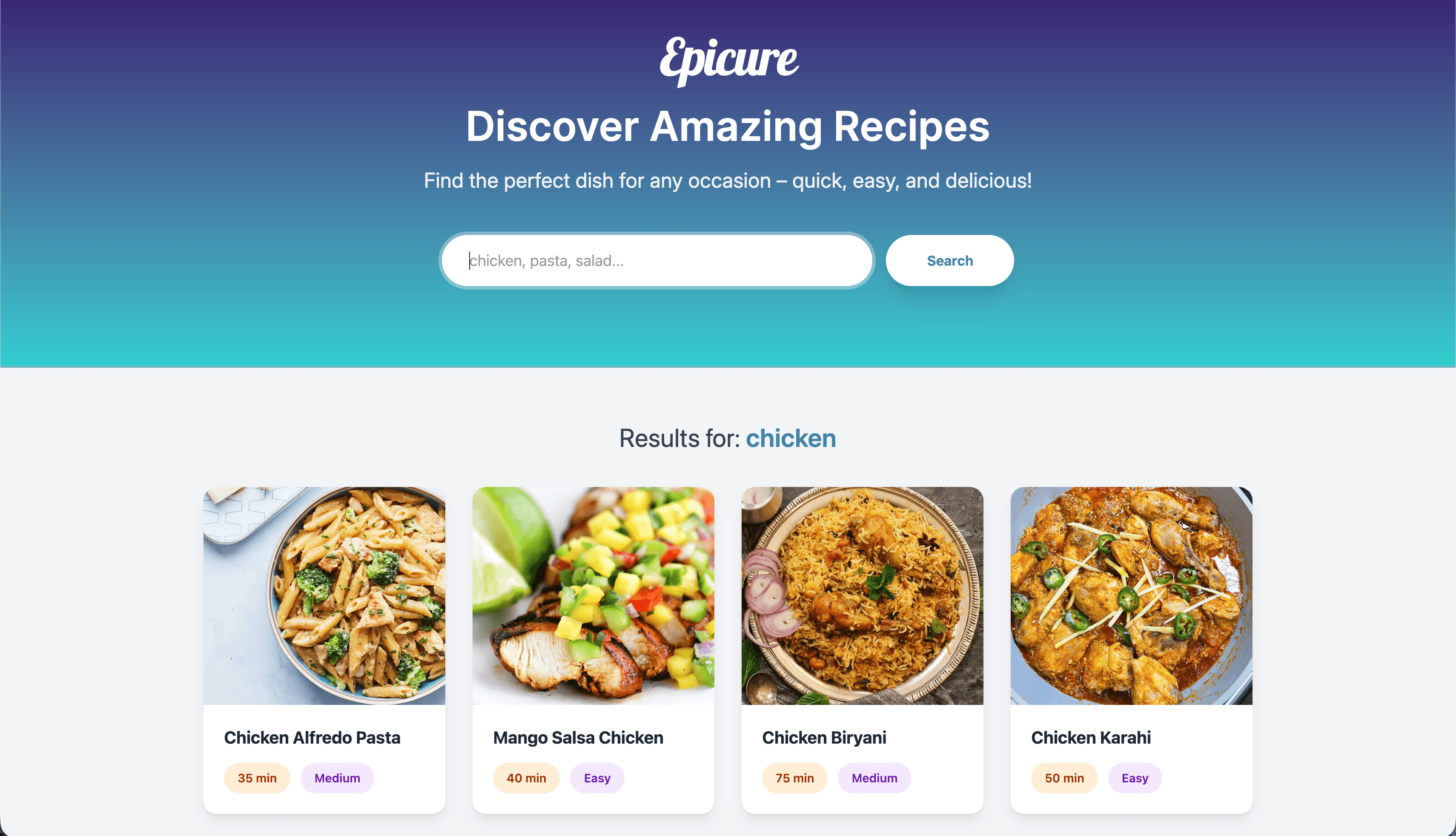
Epicure: Recipe Search App
Building Epicure was a journey in balancing beautiful aesthetics with modern performance. Since I wanted to push my boundaries with the latest versions of my favorite tools—specifically React 19 and Tailwind CSS v4—the process was as much about "unlearning" old habits as it was about building new features.
Here is a breakdown of how the project came to life and the lessons I learned along the way.
The Creation Process
The goal was to create a "warm feel" for a utility app. I followed a three-phase approach:
- The Visual Foundation: I started by defining the design system. Instead of sticking to standard UI defaults, I focused on typography. Choosing Playfair Display for headings gave the app a sophisticated, "cookbook" feel, while Inter handled the data-heavy body text for readability.
- Architecture & Routing: I structured the app into two main views by using React Router v7: a nice Home Page with a search focus and a detailed Recipe Page. I focused on "lifting state" so that the transitions between a search result and a full recipe felt instantaneous. I learned that in a recent course taught by Meta, I recently took, but nothing makes you aware of its importance more than having to do it yourself.
- Data Integration: I integrated the dummyjson.com API. This was the "engine" of the app, providing the ingredients, cooking instructions, and difficulty levels that make the app actually useful. You can find it here.
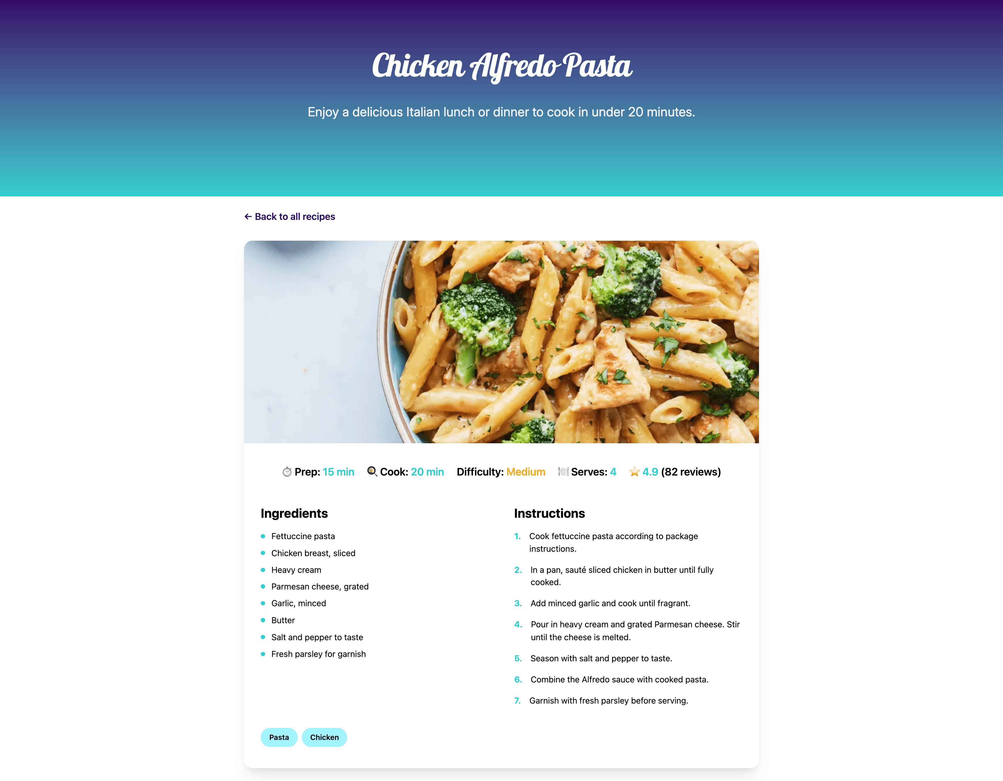
Detail of a Recipe
The Hurdles & Learning Points
Even with some experience, every project has its "wait, why isn't this working?" moments. This definitely was not the exception. Here are the main challenges:
1. The "Bleeding Edge" Challenge (Tailwind v4 & React 19)
Working with the latest versions means documentation is sometimes still catching up.
- The Issue: Some older Tailwind plugins and CSS patterns didn’t behave exactly as expected with the new engine in version 4.
- The Learning Point: I returned to the standard CSS variables and mixed them with the new "native" feel of Tailwind v4. It taught me that keeping your styling logic close to standard CSS makes upgrading much smoother.
2. The "Sub-folder" Deployment Trap
The most frustrating hurdle was getting the app to show up on GitHub Pages (the "Gray Screen" mystery).
- The Hurdle: Locally, everything worked perfectly. Once deployed, the app broke because it was looking for files at the root domain rather than the
/epicure/subfolder. - The Learning Point: This was a great lesson in Relative vs. Absolute pathing. I learned how to configure the
basepath in Vite and how to ensure the router knows exactly where it lives on the web. If somebody reads this and wonders what I’m talking about, be sure to place the right base in thedefineConfigfunction in yourvite.configfile.
3. Responsive Data Management
- The Hurdle: Recipe instructions can be long, and images come in different aspect ratios. On a mobile screen, this can easily break a layout.
- The Learning Point: I practiced defensive design. I learned to use Tailwind’s aspect-ratio tools and flexible grid systems to ensure that, whether a recipe has 3 steps or 30, the UI remains elegant and "breathable."
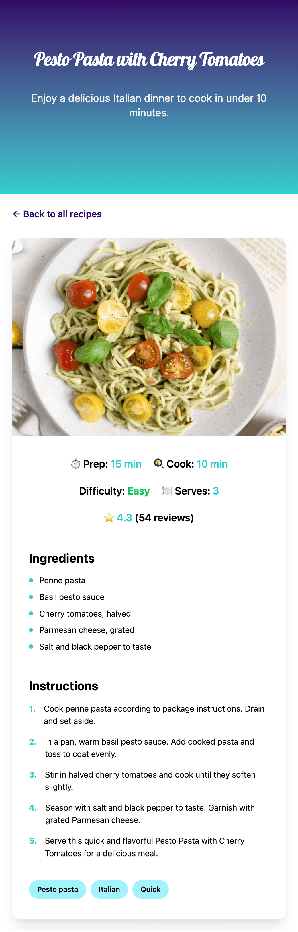
Mobile View of a Recipe
Final Takeaway
The biggest takeaway from Epicure was the importance of Project Refinement. It’s easy to get a "working" version, but the real growth happened during the polishing phase—fixing the deployment paths, refining the hover animations, and ensuring the typography was pixel-perfect. The current version isn’t the final one. I have plans to introduce filters and a dark mode soon. So, stay tuned for the updates.
Bon Appétit!